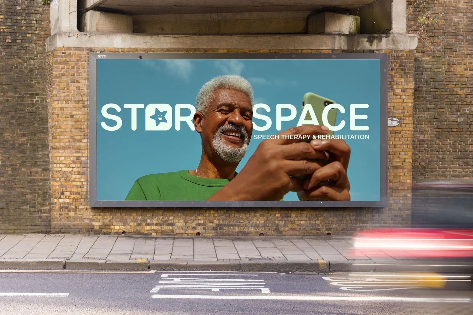
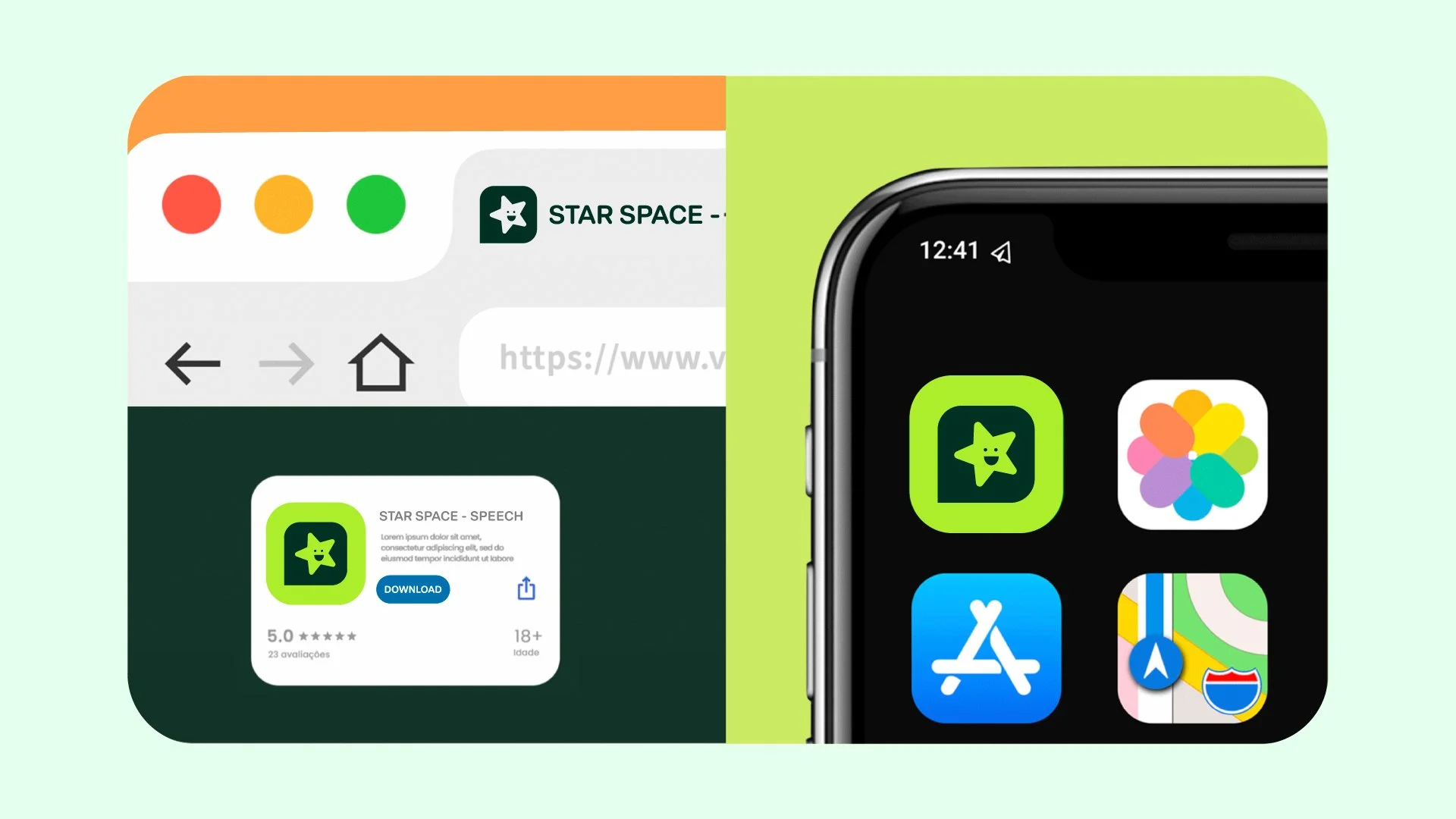
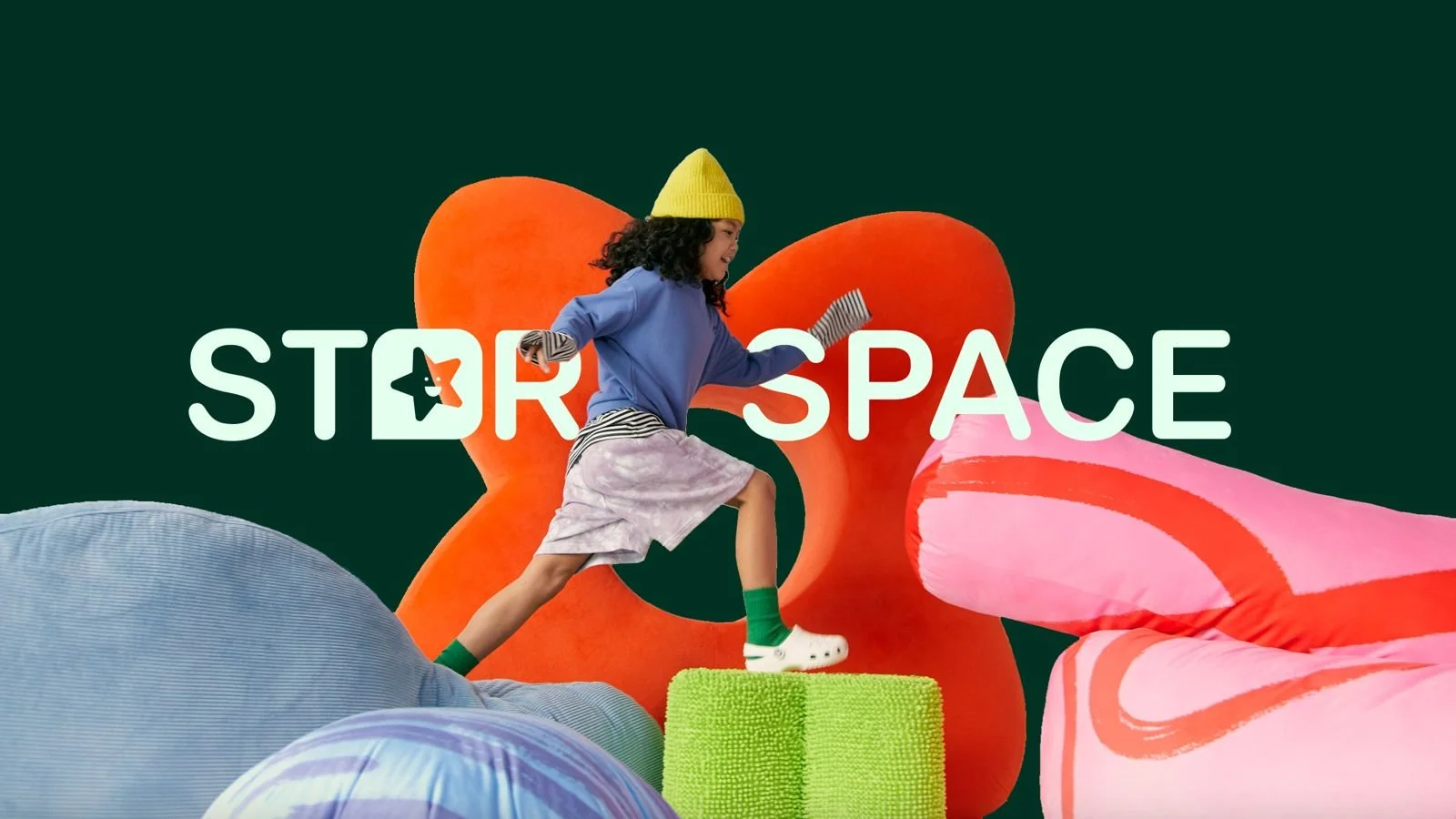
When approaching this brief for STAR it was important to us to find the balance between a brand positioning that was professional and modern while making sure we feel warm and welcoming (like all Kiwi’s) but most importantly - stand out.
To do this we’ve drawn inspiration from the NZ landscape in our colour palette and paired this with clean sans serif typography that has soft edges to emulate the care STAR takes with every client. These visual elements combined with a refreshing brand icon and logo suite gives us the tools to go to market and make an impact across all formats.